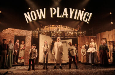
Taunton Brewhouse has a distinctive new look – one that reflects our ambitions to retain our position as the principal arts centre in the region, with a commitment to programming high quality art in all genres. Due to successful funding applications to the Government’s Culture Recovery Fund and the Garfield Weston Foundation’s Weston Culture Fund, we have been able to plan a wide range of artistic activity and an exciting programme of events for the coming year. This includes in June and July: the BrewHaha comedy weekend in partnership with Genius PR & Events, some great live music, digital streaming, free shows for families outside in Somerset Square, a day of activities to celebrate Pride (with GoCreate) an exhibition eARTH with Somerset artists (in partnership with SAGT), and a new strand, Distillery, which includes extensive plans for work with developing artists.
Staff and volunteers have been working closely with local creative agency Teapot Creative on a rebranding exercise which aims to illustrate these ambitions.
Why now? We have taken the enforced closure by Covid as an opportunity for reflection and the chance to think about future activity and what we should be prioritising. The results of a public consultation carried out in February 2021 played a large part in that discussion. Everyone got the opportunity to give feedback and tell us how they wanted to access the arts, what they wanted to see more of and what was important to them.’
The results showed that people wanted the flexibility to access the arts in a variety of ways, from online digital activity to events in outside spaces, to partnering with other venues around the region so the arts can come to them. Respondents wanted more theatre, live music and comedians – in a comfortable setting. They asked for events during the day and a place to get a good cup of coffee.
All feedback has been taken on board and influenced plans for both the venue and artistic programming which we are now putting into action.
Why this Logo?
The theatre is built on the site of an industrial-era factory and is where the Brewhouse takes its name; the new colours – Coal and Azure – reflect its industrial past and the nearby River Tone as well as the borough’s historic coat of arms.
![]()
It focuses on the structure of the building, its steps influenced by the now iconic slanted roofs and staggered seating of the auditorium.
The new logos are only a small part of the story. As well as being a thriving arts centre, Taunton Brewhouse aims to be a community hub, accessible to everyone whatever their needs and where all will receive a warm welcome.
.
![]()